Mixed Media : She Wants to Grow Old By His Side


Remember the welcome home "sign" we posted on Instagram when JD got back from his last trip?

Well, we wanted to share a little more about it in detail today...


It's actually a 12 x 12 mixed media piece I made JD for his birthday. He was on travel during Valentine's Day and his birthday (Feb 17) so I was really excited to give this to him first-thing at the airport. 

It's funky but we like it that way. 
{Have you seen how we decorate our home?!}

The text says, "She wants to grow old by his side." 

Materials consisted of scrapbook papers, paint, stamps, vintage sewing patterns, old book pages, and antique paper goodies.

JD has a little more scruff than normal in this painting, and he doesn't have a moustache connecting to his beard in real life. In fact, he shaves his moustache every single day but leave a little beard scruff for some of his trips (like this one). But I accidentally gave him a moustache so we're learning to deal with that. :)

Explanation of outfits:
JD wears soccer jerseys on his days off so I thought the scrapbook paper with numbers would be fitting. 
I used the graph paper for the shorts because he carries around a graph paper Moleskine journal to jot down notes for work.
My outfit is pretty self-explanatory. I love high-waisted skirts, shades of blues, bold belts, lace and flowers. 

The back is pretty simple with a piece of chipboard and scrapbook paper nailed to the backside of the canvas...


My gracious parents let me stay with them in Georgia while JD was on his trip. 

Mom thought it would be a fabulous idea to take an online mixed media class together... and it was!!!

To say that I now enjoy mixed media would be a complete understatement. 

When we weren't drive-by-shopping at antique stores and flea markets, we were crafting and creating on endless projects. 

This project was my favorite though. 

JD is one of my greatest inspirations, aside from Christ.

I love growing old by his side.


Who or what is your greatest inspiration?

Cruisin' through the Swiss Alps to Italy...

Happy Tuesday everybody! This past November, we embarked on yet another lovely trip to Germany for one of JD's business trips.  Friends often ask us where we love to travel to most...

Our Top 3 List goes a little something like this:

1. Germany

2. Hawaii

3. Israel

Why does Germany rank as numero uno on our list? These photos should answer that....

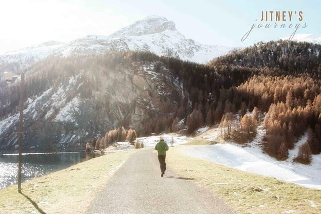
This was a part of the scenic ride from Germany through the Swiss Alps to Milano, Italy. Is it not absolutely exhilarating?! JD was able to take two days off so we booked a hotel in Italy and embarked on an adventurous 8-hour road trip. Not gonna lie... I got a tad -way- sick as JD took the curves of the Alps like a pro.

As I sprawled out across the backseat with an excruciating headache and nausea, JD stopped at this amazing lake and woke me up.

"Whit, I know you're not feeling well at all but I had to pull over here for you to see this. I couldn't drive by it without waking you up."

JD ran down this little paved road to see if anything else was down the way worth seeing. I, on the other hand, grabbed a couple of courtesy doggie bags and stuffed them into the glove compartment. 

A gal's gotta do what a gal's gotta do.

And then we saw this lonely park bench and decided that it needed a couple of newlyweds to keep it company...

After taking in the glorious views, we drove a little further south.

The magnificent mountain tops and mustard colored trees paired with the deep evergreens were certainly a sight to behold in contrast to this quaint little town. 

And yet, the views became more immaculate...

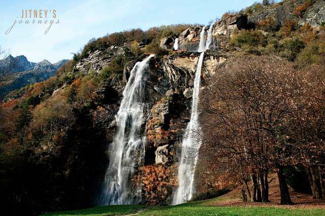
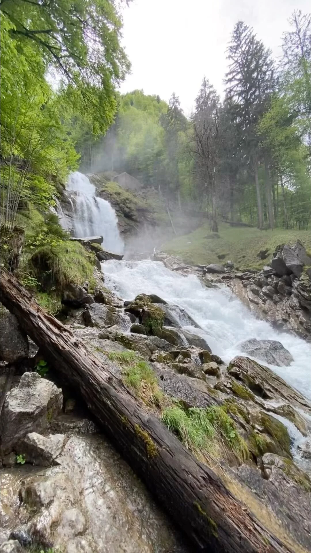
I can't even begin to explain the surprise and mystery of this waterfall.

It appeared out of nowhere. We took a turn and -BOOM- waterfall. There it is. 

In the middle of a super tiny town.

A

massive

waterfall.

JD knows that my heart bursts anytime a waterfall is in view. Memories rush into my mind from childhood when my dad would play his 12-string guitar and sing about getting lost while playing in the waterfalls with my brother. 

Not to mention, "Don't Go Chasing Waterfalls" by TLC holds a pretty big place in my heart, as it was the first song I learned how to play on the guitar (second grade). 

JD and I haven't experienced any waterfalls such as this on any other trip (Oahu doesn't have very big waterfalls). So when we

just happened to

drive along a windy road only to see this amazing wonder, we had no other choice but to make another pit stop, take photos and breathe in the fresh autumn air.

We will probably never be able to remember which road we were driving down (except that there was a restaurant somewhere along the road called "Pink Panther Pizza") or how far away we were from our destination...

but that's the entire point of this blog.

As cliche as it sounds, it's not about the destination - it's about the journey. 

So stop every once in a while to breathe in the fresh air;

to drive a little further south and search for the small wonders of nature God has hidden especially for you to find;

and most importantly, to enjoy the journey with someone you love. 

Easter : For He Has Risen


Risen.

There is no sweeter word to celebrate this season of resurrection and redemption.

"And behold, the curtain of the temple was torn in two, from top to bottom. And the earth shook, and the rocks were split. The tombs also were opened. And many bodies of the saints who had fallen asleep were raised, and coming out of the tombs after his resurrection they went into the holy city and appeared to many. When the centurion and those who were with him, keeping watch over Jesus, saw the earthquakes and what took place, they were filled with awe, and said,

TRULY THIS WAS THE SON OF GOD!"

But wait. 

The Father and the Son were not done.

The angel of the Lord appeared to Mary Magdalene and the other Mary and said, "Do not be afraid, for I know that you seek Jesus who was crucified.

He is not here, FOR HE HAS RISEN, as He said."

Matthew 27:51-54, 28:5-6

Not only did He rise from the grave... He walked back to Galilee to chat it up with the disciples and a few other folks. Well, "chat it up" may not be the best phrase to describe His conversation with the disciples, but you get the point. 

Jesus is. 

No word could possibly convey
 the greatness
the love
the character
the justice
the wisdom
the sweetness
the compassion
the grace
the power
the Truth
of Christ.

We pray that we are all able to grasp a mere portion of the magnitude of Christ's sacrifice and atonement for His children this Easter. 


Check out our post about walking the Via Dolorosa (Way of the Cross or Way of Suffering) in Israel here

Vintage Greetings : Easter Inspiration

Snow flurries have been dancing around the past two days here in Huntsville. 

What?!

It may not look like Spring outside - or even feel like it - but the Todd Nest is ready for blooming flowers and the Easter bunny.


The birds are taking over, but that probably doesn't surprise anyone who has seen our home.

Bird nests, bird houses, bird cards, and birds (not real ones, of course).


When I was spending time with my family in Georgia, my grandmother gave my mom and me a huge bag of old greeting cards and postcards (along with the vintage scarves). We sat down at the dining room table and distributed those beauties amongst ourselves. Her and I are very similar but our tastes in vintage greeting cards couldn't be more different. 

We would've been in trouble otherwise.

The first greeting card ("HELLO" with the birds) quickly became my Spring decorating inspiration. I taped the back to 8.5" x 11" kraft paper and framed it with an antique white frame. 

The second greeting card has a vase of seven small flowers you can pull out.
"A Seven Day Cheer Card for You"
Each flower has a sweet quote hidden hidden its petals.
They don't make cards like this anymore, people...
I displayed it in a vintage flower frog. It's just one bonus element of our Easter display in the kitchen (main photo on top collage).

You probably can't tell from the picture but I slid one of the old card boxes between white books to give the glass jar (holding tiny nests) a boost. It has a nice aged tint to it with purple flowers lining the side. The perfect accent.

Vintage spring-themed cards would look breathtaking on a cute indoor Easter wreath or held up by vintage forks in a vase for your Easter dinner centerpiece.


What is your inspiration theme this spring?


A Little DIY Inspiration for Your Thursday...


Do you subscribe to the Better Homes and Gardens emails? 

There is so much inspiration hidden within my inbox because of it. 

In all honesty, I skip over the emails pretty often but with Spring setting in quickly, I need some fresh inspiration. The past email was packed with fantastic-ly fresh ideas you can find here. Needless to say, I've been pinning pretty rapidly this morning. 

The picture above really captured my heart. It's simple, it's lovely and it's super inexpensive. Here's the excerpt from BH & G in how to create this set-up for yourself:

Sharpie Wall Frames

It’s hard to miss the writing on the wall with these show-stopping frames sketched in black marker. Model the frame shapes after ornate versions of the real thing, using antique portrait frames for inspiration. Add diagonal lines at the corners to suggest depth. To highlight the differences in dimensions between your frames and art pieces, hang a three-dimensional sculpture or vase within one frame.


Some may be afraid to cover their walls with Sharpie markings and I don't blame you one bit!
I'm thinking vinyl may be a better route to go. 

Here are a few Etsy shops that have amazing, vintage-inspired vinyl frames:


Here are another couple of projects I will be embarking on from the collection of BH & G grouping:


I love this twine-enhanced vintage key with the subtle, soft background.


These printed maps are pure beauties. You know this traveling couple will be hanging up a series like this in our home!!


Which project will you be trying out this Spring?


Etsy Product Release : Moustache Burlap Tote


And we've got ANOTHER Etsy Product Release!! 

Find the Moustache Burlap Tote Bag here.


It's oh-so-simple and oh-too-cute. 

To be honest with you, I'm quite unsure of the best way to spell moustache. Regardless of your personal preference in spelling it "moustache" or "mustache", this burlap tote bag is the perfect size to hold all of your valuables or party essentials. You can stock it up with fantastic goodies and give it away as a gift. In fact, we think this would be a fabulous tote to fill with wonderful trinkets for a bridesmaid's gift.

The only thing you can't do with this simple tote is tape it above your lips. 


This was the first time I have posed for any of our shop media. In fact, it was a self-photo on a timer. I hope it doesn't look ridiculous... You would tell me if it did, right?

The vintage scarf is from an amazing collection of scarves my grandmother (whom we refer to as GinGin) so lovingly gave me. Not a day has gone by that I haven't had one in my hair (it's been a couple of weeks). 

Back to the tote...
Here are the specifics:

One black moustache is stenciled in the middle of the front of the bag. If you would like a different colored moustache, we would love for you to message us with your preference and we will customize your order without a problem. The backside of the burlap bag is plain unless you would like us to monogram a name or initial across the back for $3 per tote.

HAPPY WEDNESDAY, EVERYONE!!


Etsy Product Release : Easter Bunny Burlap Tote


Do you realize that Easter is in THREE weeks!? 


Surprise... The bunny will be hoppin' in early this year! 

Don't have a panic attack YET. We can help you take care of one thing....

Introducing the Easter Basket Tote:


Isn't it lovely??

You can find it in our Etsy shop here

My mom and I came up with this little beauty in February while JD was out of the country. She is a genius and I'm so thankful for our mother / daughter / closest girlfriend / business-partners relationship. I can't wait to show you the antique booth I helped her and dad set up at the Cotton Depot.

Now, back to the Easter totes...

Our little cousin, Emma Kate, came over for the day to be our Jitney model. She was a perfect lady and her mom dressed her in the PERFECT attire!! 


The bag is blurry in the photo below but it was such a sweet photo of Emma Kate that I couldn't resist in sharing it!! She showed off that tote like a paid pro.


The Deets:

This sweet Easter Bunny burlap tote bag is perfect for the kid on the hunt! It's large enough to hold tons of candy but small enough for a young child to carry around.

Don't forget to order one for your favorite teacher too!

One white Easter bunny is stenciled in the middle of the front of the bag. We handmake each bunny tail out of special paper. If you would like a different colored bunny, we would love for you to message us with your preference and we will customize your order without a problem. Each bag comes with a special Easter tag attached to one of the handles. The backside of the burlap bag is plain but can be stenciled with a name or monogram in any color for $3 extra. Message us and we will create a custom order if you would like it personalized.

The burlap bag is lined with a sheer thick material to prevent items from slipping through the burlap material. It has been coated with a protective coating for easier cleaning and color fastness. However, we do not recommend machine-washing. 

Dimensions: 9" x 11" x 4"

DIY Blog Design : How to Link Your Blog Buttons {Step-by-Step}

Yesterday we learned how to make blog buttons here

It's only fair to share the secrets of how to link the blog buttons, right?

Put your party hats on, people. It's time to learn...


Let's get started with a website to host your images.

Log into your account. 

If you don't have one, we suggest Flickr.

Hit the upload button (you'll find this at the top of the page).

Click "Choose photos and videos to upload" in the middle of the screen, select your blog button files and open those beauties.

Your page should look a little something like this: 


Now you're ready to rock 'n roll.

STEP 1: 
Because we don't like for our Flickr page to be filled with all of our bloggin' elements, we click the privacy button for these images. Hit "Only visible to you" and "Hidden from public searches" if you'd like to do the same.


Click the "Upload Photos" button at the top of the page and the buttons will begin publishing to your Flickr account. 


STEP 2:
Click on a blog button from your photostream. Hit the "Share" button and choose the "Grab the HTML/BB Code" tab. You will see your code as well as options for the image size. We went with the small size as it measures 200 x 200. Just the size we need for our sidebar.

Click on the code, right click and hit copy.

We're finished with Flickr for now. Let's move to your blogger dashboard. 


STEP 3:
Hit the Layout button on the sidebar menu.

Click "Add a Gadget".

P.S. Sorry for the overwhelming Layout template on the example. It's a little overcrowded...


STEP 4: 
Scroll down and click on the "HTML/JavaScript" button.


STEP 5:
A box will pop up like the above image. 

Paste your code from the Flickr account inside of the box.

We're going to mess around with code a little now...

STEP 6:
Replace the first link with the link to the page you would like the button to direct. For safe measures, delete only what is inside of the first set of quotation marks. (Although, I also like to delete the title gibberish too. If that's not too confusing, go for it!!)

For example, we want our France button to direct our readers to a page that shows all of our travels from France (which we haven't written about yet... note to self: need to get on that).

We replaced "http://www.flickr.com/photos/jitneysjourneys/8509521400/" title="CircleBlogButtonFrance by jitneysjourneys, on Flickr" with 
"http://jitneysjourneys.blogspot.com/search/label/France"

Leave the second link alone, as that is the link of the original image. 

Now we get something that looks a little like this:


Click "Save" on the HTML box.

Click "Save arrangement" on your dashboard.

Boo-yah.

You just linked up a blog button to a website.

You're awesome.

If everything went well for you, carry on, good friend! Otherwise, we've written up a couple of questions that we felt may be brought up among our readers and wrote the answers below. If we don't cover your question(s), write your question in the comment box of this post just in case others have similar inquiries and we will answer to the best of our abilities. :)

***

What is a label?

A label is a word you can use to identify a series of posts. You will find a box in which you can enter labels in the Post Settings toolbar. For example, we would write the word "tutorial" as a label for this post. Other labels could be "DIY" or "how to". On our sidebar, you will find a Tutorials button that will link you to all of our tutorials. The link for that is:
http://jitneysjourneys.blogspot.com/search/label/tutorial

If you have labels for a series of posts, you can use the same link format.
http://YOUR-DOMAIN-NAME-HERE/search/label/NAME-OF-LABEL

Use that link if you want to link a blog button to a series of posts.


***

Why does your new code have the dimensions of 170 x 170?

We decided that we wanted our sidebar to be smaller than 200 x 200 after seeing the finished product so we made the dimensions smaller to fit our ideal blog size. If this happens to you, you can change the dimensions in your code but be sure to keep the sizes consistent to the original dimensions (i.e. changing 200 x 150 would be 100 x 75 if you wanted to decrease the size by half).


DIY Blog Design : How to Make a Blog Button {Step-by-Step}

Today we're going over....


Are you pumped?

Let's do this.

**You can use any photo editing program but I believe Photoshop is the easiest - as well as the most convenient - tool when trying to make more than one blog button in the same format.

STEP 1: Getting Started
Open a new document in Photoshop. 
I made the dimensions 500 px x 500 px with a transparent background.
We will change the image size before posting the image but this size is much easier to work with.


STEP 2: Create an Ellipse
Click on the ellipse tool and create an ellipse by pulling from the top corner to the bottom corner, forming a perfect circle. Be sure to hold down the Shift button while creating the circle for perfect measurements on all sides.


STEP 3 : Place an Image
File  > Place 
Choose the main image you would like to use for your button.


STEP 4 : Size / Adjust the Image


STEP 5 : Grab & Pull
Grab and pull the ellipse shape into the same layer as the placed image. 

STEP 6 : Pioneer Woman Action
I use the "Seventies" action from the Pioneer Woman to add some vintage love on my blog button images. You can download her incredible group of Photoshop Actions here
If your actions window doesn't appear, click Window > Actions. After you download the actions, click the action you'd like to use and hit the Play button.


STEP 7 : Erase Background
Click on the Background Eraser Tool.
Select the Shape layer (unlike the screenshot below - whoops!).
Erase AWAY!! 


STEP 9 : Or Delete the Shape Entirely
I feel ridiculous after doing that step. You can delete the shape entirely and have the same outcome. 
But erasing is just so much fun...


STEP 9 : Add Banner
Find a banner image online and download (or you can make your own). 
File  > Place the banner. 


STEP 10 : Color Overlay
Pull up your color scheme in a different window so that you can still see the file you're working on AND the color palette. 
Double click on your banner layer.
Click on Color Overlay. 
Click on the color block to change the color of the banner.


STEP 11 : Change Banner Color
Click on the eyedropper tool.
Click a color of choice from your color palette with the eyedropper tool.
Click OK.
There's no need to copy the number. I'm not really sure why I put that there.


STEP 12 : Add Text
Click on the Type Tool.
Add text, change the size and have fun with font options.


STEP 13 : Align Layers
Maybe I don't know my way around PicMonkey enough yet, but this is a big reason I choose Photoshop over other photo editing programs.
Select the text and banner layers (hold down Command while clicking on the layers). 
Click Align Horizontal Centers. 
Boom. 
No eyeballin' here.

**Now is the best time to save this document. We will use this document as our Blog Button Template.
File > Save As > "Blog Button Template"
Save as a Photoshop (.psd) file. 


STEP 14 : Resize Image
Let's make this image the perfect size for your blog. 
I like 200 px x 200 px for a toolbar size. You may want to go smaller though. Just make sure that the width and height are the same sizes. 

Click OK. 
File > Save As > "Blog Button {Image Name}"
For example, I saved my image as "Blog Button France".
Save as a .png file.


STEP 15 : Create More Buttons
Guess what!? 
You don't have to start a new document in order to make more buttons. 
Open your Blog Button Template again.
File > Place a new button image.
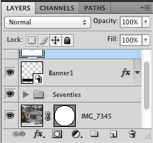
This image should be a layer in between the first image and action. Your Layers box should look a little something like this: 


Pull the circle shape into the new image layer. Click the eye on the first image layer so that you won't be able to see that image any longer.
Hopefully you have the image sitting perfectly in the circle now.
Change the text in the banner.

File > Save As > "Blog Button {New Image Name}"
For example, I saved my image as "Blog Button Bungalow".
Save as a .png file.

Voila! 

You just made two blog buttons. 
Whoop whoop!
Now you have the ability to make as many as you'd like!!

Come back tomorrow to see how we will place the buttons onto our blog.


We hope you enjoyed this tutorial - and that is was super thorough and helpful!
We aren't professional designers by any means but I love playing around with our blog's appearance on a frequent basis. Please let us know if you have any questions and we will try our best to help!


DIY Blog Design : How to Pick a Color Palette


Ok. So neither JD nor myself are professional graphic designers, by any means. However, I looove learning how to spice up our blog design on a very consistent basis. 

Anytime JD is away on travel or when we're off traveling somewhere together for his job, I revamp our blog design in some way or another. Designing helps ease my anxiety and makes the time fly by as I wait to have my husband back in my arms.


[Side note: Can you tell from our new design that JD has been out of the country for three weeks!? Needless to say, I really really missed him. I spent the three weeks with my parents crafting, leather-working and helping to set up my mom's booth at The Cotton Depot. It was a beautiful time with our amazing friends and family in Georgia, but I still really missed my husband. He flew in Saturday where I greeted him with this painting at the airport. But more on that another day.]


It would be so much easier if I bought a template from one of the awesome professional designers on Etsy, but I'm a stubborn DIY-gal. 

A very stubborn DIY-gal... And I married a very stubborn DIY-guy. 

We're not stubborn in the sense of close-minded, rather in the sense of being frugal and wanting to do everything with our own hands.

So it only makes sense to try our hands at designing our own blog... right?

Now, let's get to chattin' about a main element of design.

Color.

It's crucial to design.
Absolutely crucial.
So choose wisely.
For our newly revamped blog design, I picked "Sparkled Hues" from Design Seeds.


I wanted a color palette that would incorporate the colors of spring but could possibly carry into summer, if needed. So we have Easter blues as well as a Fourth of July red, white and blue. I love the pop of red but only implement it in smaller places on our blog.

Color schemes are so wonderful and inspiring that I made a Pinterest board here. Color palettes are perfect for anything design... websites, home decor, sewing projects, weddings, you name it!

You want to choose a palette with four to six complementing colors to integrate into your design.

Here's a great tutorial from The Mother Huddle on how to create your own color palette using a photo with PicMonkey.

What do you think of this palette? 
What are your favorite colors to work with?